
One Vision Design System
Overview
As the Design Systems Lead at CareerBuilder, I took a pivotal role in shaping the One Vision System—an integrated framework that encompasses our design language, pattern libraries, comprehensive documentation, and guides for our reusable component library. My efforts were dedicated to establishing these standards, which have significantly contributed to elevating the design delivery and fostering unwavering consistency throughout the entire product ecosystem.
For the past 20 years, CareerBuilder has been know for their job board but has moved into the SAAS space. Legacy platforms and software acquisitions (including analytics, hcm, search, and employment screening tools) have led to design inconsistencies across the CB ecosystem.
Goals
Our main goal was to create set of standards that can be referenced by anyone inside or outside (vendors) of the organization to improve design consistency, and speed up the design process when creating user interfaces for applications within our product ecosystem. Overall, providing a better experience for our users.
Other benefits includes improving ease-of-use, growing brand recognition, improving brand perception, enabling product teams to move faster, and building a library of easy to reuse assets.
Our long term vision is a living design system that is the source of truth for design, development, and product. This design system will evolve as our brand and product solutions evolve.
The Start
A small team was formed to show the value a style guide would give to the family of products. After C-Level buy-in, the governance and standards teams team were created. The standards team consisted of designers across the internal and external teams who were the doers. The governance committee consisted of stakeholders whose main role was approval and roadmap adoption.
My Role
Standards Team & Governance Committee Lead
Standards Team
Interaction Designers, Ui/Visual Designers, Front End Developers, & Marketing Team
Governance Committee
Stakeholders (including C- level), Engineering Leads, & Product Owners

The Constraints
Convergence of tools, the different roadmaps, the countless teams, and the handful of platforms led to the team initially focusing on atomic level elements. We loosely followed the atomic design methodology and started at the atomic level to identify our visual language.

The Process
With the atomic level elements defined in an easily accessible excel sheet we then requested help from the larger ux team. We created a new pattern process to create transparency across the teams and to focus on design rationale with documentation.
"If it isn’t documented, it doesn’t exist.”
Miriam Suzanne | Author, Designer, Developer
Establishing The Design Language
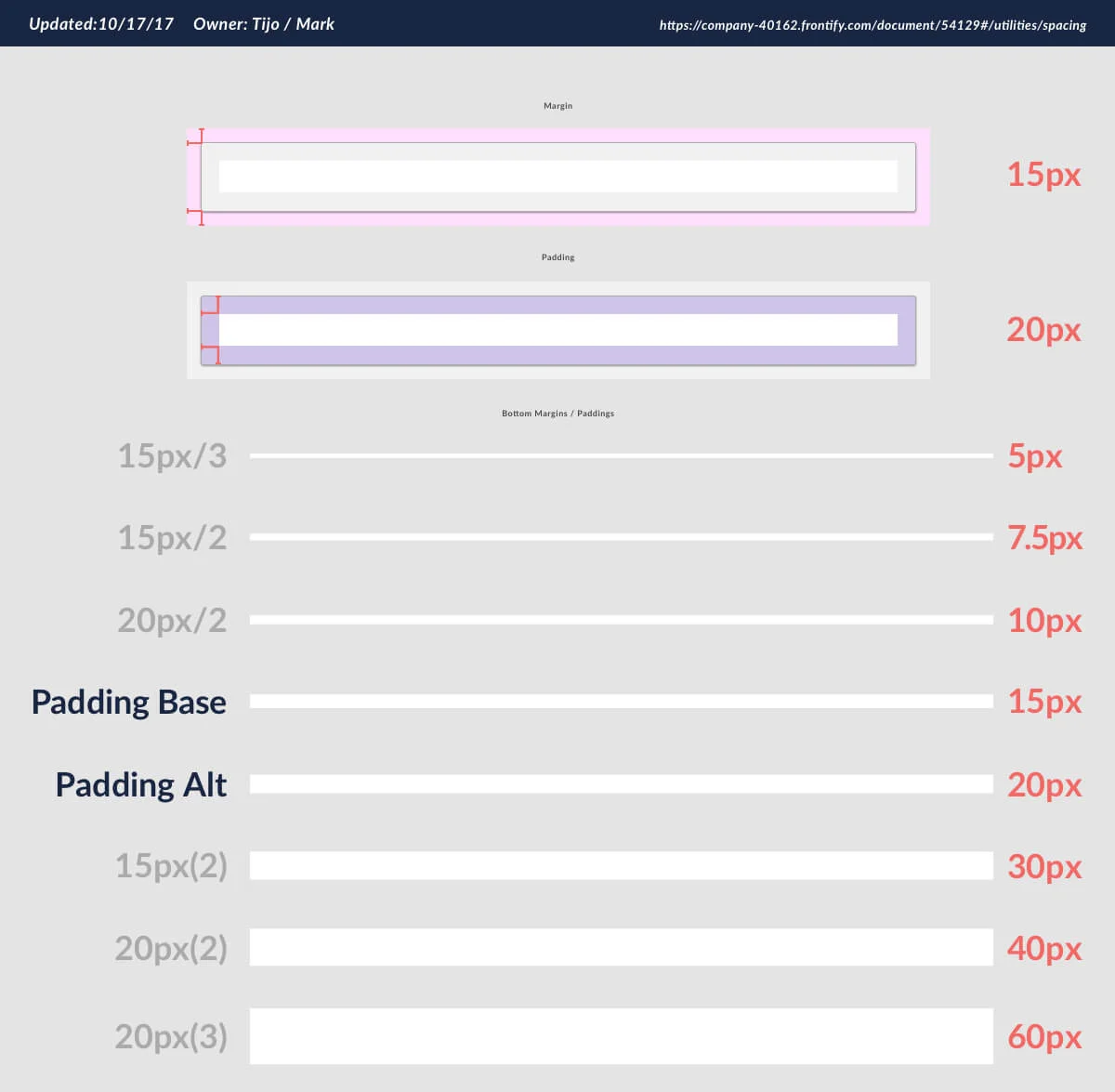
Establishing the design language (color, typography, font sizing, spacing) was the natural place to start. We partnered with the marketing team to make sure that our product design language closely matched the establish brand guidelines.
Also, partnering with engineering is essential to create a reusable, code based, component library that worked with the agreed upon framework. The tech leaders established angular as the framework of choice.

Start with Mobile
Once the design language is established, and vetted, it’s time to move on to creating components with your atomic elements. Our team felt that mobile first was the best way to proceed. While workin on our mobile apps we created screens (pages) and deconstructed the components to create our mobile app pattern library. See the iOS library below.


Standards Successes
Establishing the first pattern library will make your team happy and that’s a big win. The single source of design truth allows your team to focus on the bigger problems. The standards become even more successful when product and engineering start referencing the documentation correctly. EG:
“Are we using the right pagination on this table?”
Survey questions (Software usability surveys)
One way to quantify success is by regularly surveying and testing the standards with your users. These metrics were taken 6 months apart. The yellow set represents the first surveys we sent our to our users before the standards were implemented. The green set were numbers returned after standards were being implemented through product releases. The numbers aren’t drastically better but show that forward progress was happening.


“Do these products look like they are from the same company?”


“Is it easy for me to work with multiple products because they work similarly?”
“I don’t say it enough but thank you for standardizing our tools. We’ve come a long way in the past 12 months.”
Chief Product Officer
Retrospect
Establishing standards can seem like a tough hill to climb but sticking with it has been very rewarding. First, it allows the design to quickly repurpose element. This speeds up design time and facilitates product consistency. Second, once the reusable component library is built in partnership with engineering then development time is saved across the various teams.
The real hurdles involve buy-in and managing design time. We got caught up in the day-to-day deliverables and this eventually leads to neglect of the standards. The key is to have an established process that integrates the standards into everyday work. Standards can easily become obsolete.
Setting up a system for success
Knowing what I know now has taught me (through trial and error) that there needs to be a few established prerequisites for a successful system:
A design system needs to be treated as a product with a delivery roadmap
C-level buy-in is mandatory for success (CPO or even CEO)
A dedicated team that solely focuses on system deliverables and releases