

The Trade Desk
Chrome Framework
In 2019, I began leading the Solimar UX initiative at The Trade Desk, transforming the user experience over eighteen months. As the UX design lead, I redefined navigation and created a new user experience framework, earning patents for our innovative designs.
I’m excited to share our User Interface Framework, which revolutionizes how programmatic agency traders use the platform. Focused on user-centric design, it features a revamped information architecture, streamlined contextual actions, a universal swapper component filter, and a powerful universal search. Despite challenges, I played a key role in design, discovery research, stakeholder alignment, and overcoming controversies to ensure the success of these releases. Our collaborative, iterative approach has delivered a UI framework that meets the evolving needs of our programmatic audience.
Design Overview


MY ROLE
People Manager, Design Leader, Senior Individual Contributor, Facilitator

THE TEAM
Interaction Designers, Visual Designers, & Systems Designers

STAKEHOLDERS
Design Vp, Design Director, Ux Team, Systems Engineering Team

The Problems
Inconsistent Platform Experiences
Over the span of ten years, the platform's multiple product pillars were developed by various engineering teams at different times, leading to inconsistent user experiences. This lack of uniformity resulted in significant design and technical debt.
Aesthetic-Usability Effect
Our competition (Google, Amazon, Meta) had established systems and patterns that were visually more appealing to users. This led to consistent comparisons, with users perceiving our competitors' features and experiences as superior in terms of spend and performance results, regardless of actual effectiveness. This perception issue undermined user confidence in our platform.
Poor Information Architecture
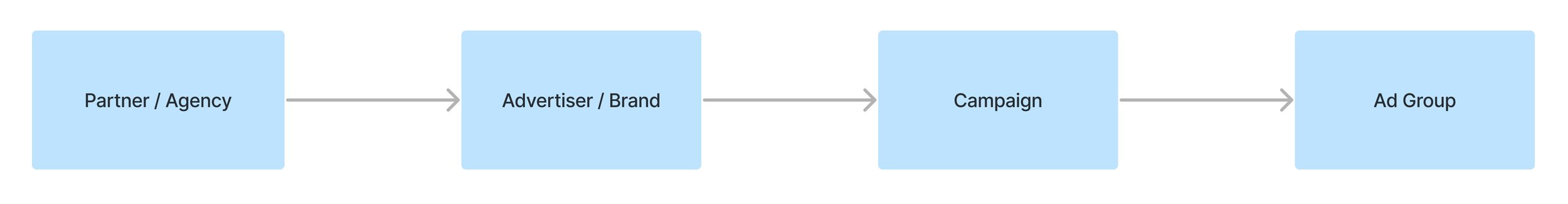
Ad tech DSPs generally have complex parent-child architectures, but The Trade Desk's particularly poor information architecture deviated from best practices. This inconsistent architecture and navigation resulted in long learning curves that did not align with the mental models users developed on more intuitive DSP platforms.
Design Discovery
Legacy Platform Discovery


Legacy BreadCrumb Navigation

Hidden Partner Libraries

Hidden Advertiser Libraries


The Outcomes
Competitive User Experience
Develop a cohesive framework following design best practices to ensure a uniform and competitive user experience. Align with user mental models to create intuitive, seamless interfaces. By focusing on exceptional experiences and superior feature outcomes, we aim to surpass our competitors and deliver unmatched user satisfaction.
Improved Situational Awareness
Improve user awareness within the platform to enhance their comprehension of the current context. This involves providing clear and relevant information, helping them understand where they are in the platform, where they're going, what actions are available, and how their actions impact their overall goals. Ensuring that experiences behave as users expect increases confidence and reduces cognitive load.
Agile Experience Framework
Engineer a robust and scalable foundational framework designed to serve users effectively for the long term. This framework should be adaptable to evolving user needs and industry standards, supporting consistent updates and improvements


The solutions
The Framework Components
Navigation Sidebar
The Partner / Advertiser Swapper
Universal Search
Core and Contextual Tabs
The Contextual Action Bars
The H1 Component
The Right Toolkit
1a. New Sitemap

1b. New Navigational Architecture

2. The Swapper
Our standout swapper interface guides users through layer options effortlessly, eliminating complex tree navigation. It simplifies workflows, enabling quick, sequential tasks across contexts. This unique feature transformed our ad tech hierarchy, streamlining processes and allowing tailored customization for partner and advertiser portfolios.


Early Exploratory Wires


Responsive Swapper Wires


4 & 5. The core and contextual Action Bars
In our intricate ad tech platform with over 160 actions, we streamlined efficiency by using contextual action bars and the swapper component. These bars highlight critical programmatic tasks within our complex hierarchy, reducing the need for users to search for actions across the platform.


Early Exploratory Wires & PACA Mapping


7. The Right Toolkit
Early Exploratory Wires


Pre-Solimar Release Feedback
User Validation
Campaign Workflow (Core & Contextual Tabs)
Users spoke about their current multiple browser tab methods and mentioned that the contextual tabs would be helpful for new users who are learning the platform.
“I would say for new users. This might be a little bit more predictable; the UI looks a little bit more like a lot of the applications in general web apps or desktop apps that I'm familiar with outside of the trade desk. And so, I think in general, it would be a little bit easier to learn, but I don't think there's a lot of relearning if you already know our platform.”
“I like this for clients because I think it will be easier for them to grasp.”
“Yeah, I like this behavior of like keeping the breadcrumbs up here. When I'm in my ad group right now – unless you actually open a new browser tab – you can't really go back to campaign that easily.”
RIGHT RAIL Toolkit
Keep Doing: A toolbar that follows them through the platform. Notifications within the right toolbar.
“I really like the right-hand side being like a place to get notifications. I think filtering to creative notifications as a subset of the notifications tab is helpful.”
Post-Solimar Release Feedback Update


The UX Patent
Inventor on US Patent 11354142-B1:
Computing Network For Implementing A Contextual Navigation And Action User Experience Framework And Flattening Deep Information Hierarchies.
Abstract
A contextual navigation and action user experience framework that facilitates workflows across multiple contexts and levels of object hierarchy is disclosed. Exemplary features include a swapper interface, an action toolbar with contextual buttons and contextual tabs, and a toolkit that provides an overview portal to view alerts, cross reference information, and perform actions on objects and insights that are important to the user across an entire product suite.

Qualitative Feedback
Addressing Eye Strain

First-Release Iteration of the Action Bar
After the Solimar release, user feedback highlighted eye strain and brightness issues. Partnering with a qualitative researcher, we studied programmatic traders globally. We learned that lighter components improve contrast and reduce strain, especially in low-light settings or for users with astigmatism. Dark-mode preference also emerged, enhancing user experience and accessibility.
As the lead, we prioritized reducing eye strain with short-term solutions like a grey action bar. This balanced user comfort and business needs without the resource demands of a full dark mode.
The New Grey Treatment

Responsive Contextual Action Bar
Action Icons and Motifs


UX Leadership Response
Despite initial criticism, we revised the grey action bar to include brand colors, addressing stakeholder concerns and securing leadership approval. After months of iterations and collaboration with engineering, this change significantly reduced eye strain complaints.
We effectively addressed both the eyestrain complaints and the UX leadership requirements, but we fell short of fully satisfying the user's request for a dark mode.
Introducing Marketplaces
Retail Data and Measurement Marketplaces offer valuable flexibility to programmatic trading, enhancing their performance and analytics capabilities. Our next strategic move involved integrating these marketplaces seamlessly into our platform architecture while simplifying the campaign-building process for our users.